CareKit creative property
Design Guide
Imported from the CareKit design export and rebuilt with native Angular Material components, theme tokens, and responsive SCSS.
Stage
Variant
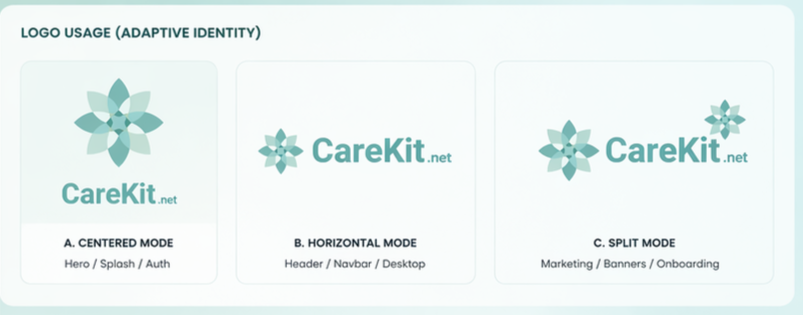
 CareKit.net
A. CENTERED MODEHero / Splash / Auth
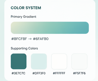
CareKit.netCareKit.netCareKit.net#BFCFBF to #6FAFB0 · primary gradient
#6FAFB0Primary
#3E7C7CPrimary Dark
#DFF3F0Secondary
#FFFFFFBackground
#F5F7F6Surface
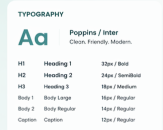
Aa
Poppins / InterClean. Friendly. Modern.
H1Heading 132px / Bold
H2Heading 224px / SemiBold
H3Heading 318px / Medium
Body 1Body Large16px / Regular
Body 2Body Regular14px / Regular
CaptionCaption12px / Regular
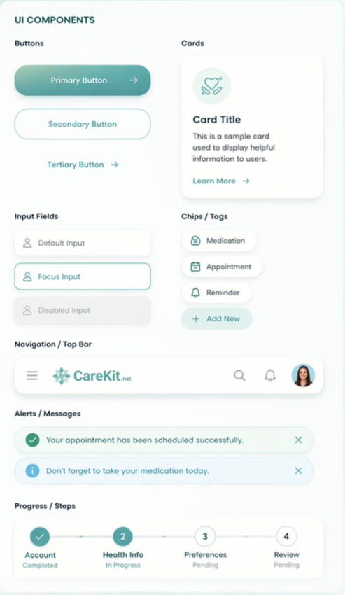
SuccessYour appointment has been scheduled successfully.
AccountHealth InfoPreferencesReview
Imported source
Design Export Frames